Absenteeism Radar
An absenteeism dashboard that separates signal from noise without exposing individuals.
Fictional data. The company (Vallora Logística S.A.), its sites, managers and employees do not exist. I built the dataset from scratch in Python to reproduce problems found in real data. No number on this page describes a real organization.
The dashboard screenshots are in Portuguese, the project’s original language.
The problem
A logistics operator with four distribution centers and about 1,250 people tracked absenteeism with a single monthly number. Over two years it did not move: 3.77% in 2024 and 3.77% in 2025. As far as leadership was concerned, the issue was under control.
Operations managers disagreed. They talked about more overtime to cover night-shift absences and more accidents among new hires. The number was right, and so was the perception; what was missing was a way to see both at once.
What the dashboard showed
- The stability was arithmetic. The end of an infectious disease outbreak and fewer long-term absences offset an 8% rise in all other short-term absences.
- The rise had an address. In two night-shift teams at the Duque de Caxias site, one in Picking and one in Shipping (Separação e Expedição), the short-term rate went from 3.5% to 6.5% starting in April 2025. The rest of that site and the night shift at the other sites did not change. Both teams had changed supervisors a few weeks earlier: a lead worth investigating, not a conclusion.
- The night shift has a higher rate across the whole company (adjusted rate ratio of 1.31), and new hires are absent 1.8 times as often.
- A few events account for many hours: 1.6% of events make up 34% of lost hours.
- One apparent association was spurious. Large teams seemed to have more absences, but the only very large team worked nights. Once you split by shift, the effect disappears.
Gallery
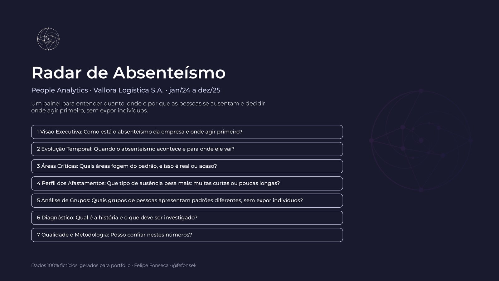
Click a screen to enlarge it.


How it was built
The data. Thirteen tables in the export format of a Brazilian ERP: pseudonymized records for 1,826 people, scheduled hours for every day (662 thousand rows) and 13.6 thousand absence events. Recording each day’s scheduled hours is what makes it possible to calculate the rate in hours and handle late arrivals, part-time schedules, vacations and mid-month hires correctly. I also injected 146 typical extraction defects (duplicates, reversed dates, orphan keys, inconsistent spellings) so the data cleaning had something concrete to solve.
The cleaning. 26 Power Query queries clean and validate the data. One dashboard page shows what was fixed and how much, so readers know whether they can trust the numbers.
The model. A star schema with three fact tables at different grains (scheduled hours, absence per day and absence event) and 97 DAX measures, organized by topic.
The statistics. Three choices define the project:
- Break it down before comparing. The total rate is always split into short-term (up to 15 days, the part a line manager can influence) and long-term (absences managed by occupational health).
- Require evidence before raising an alarm. An area is flagged as critical only if the deviation is large and statistically consistent (z-score of event frequency). A six-person team with one long absence does not trigger an alert.
- Test the obvious associations. A negative binomial model, adjusted for site, department, shift, age, sex, tenure and year, separated what holds up (night shift, tenure, site) from what does not (team size, sex).
The report as code. A single specification describes every visual (position, fields, measures and the question it answers). From it, a Python script generated the first version of the report, in Power BI’s project format, along with the documentation and the wireframes. The dashboard was then refined in Power BI Desktop. An audit script still checks that every measure used exists in the model and that every number quoted matches the data.
Privacy as a requirement. No names, national ID numbers or email addresses; health reasons only in aggregate; groups smaller than 10 people suppressed; row-level security by site and by manager; and an explicit note that the dashboard is not meant for disciplinary use.
What this project demonstrates
- Understanding the business before opening Power BI: the right question was “where did the rate get worse”, not “what is the rate”.
- Dimensional modeling and DAX on data with different grains and calculation rules that change the result.
- Statistics applied to decisions: decomposition, consistency tests and control for confounding, without mistaking association for cause.
- Design and communication: each page answers one question, status is always labeled and the palette is restrained.
- Governance and privacy: documented rules, visible data quality and protection for small groups.
Want this dashboard with your company’s data?
The same structure works with an export from your payroll or time-and-attendance system. Tell me what your data looks like today and I will tell you what can be done.